Every time a person lands on a webpage, they make a series of rapid, largely unconscious decisions. Where do I look first? What is this page about?
Understanding what is visual hierarchy in web design is is understanding how those decisions are shaped. Visual hierarchy is the system of visual cues size, colour, contrast, spacing, positioning, and typography that tells a visitor where to look, in what order, and what matters most. It is not decoration. It is architecture.
What Is Visual Hierarchy in Web Design?
Visual hierarchy is the deliberate arrangement of design elements in a way that communicates their relative importance and guides a user’s attention through a page in a specific sequence.
In a physical environment, hierarchy is communicated through obvious cues a headline above a paragraph, a large sign above a smaller one, a speaker at the front of a room. On a webpage, those same principles apply, but the designer has a much wider toolkit: scale, weight, colour, contrast, whitespace, alignment, and positioning all contribute to the hierarchy the visitor experiences.
The goal of a well-constructed visual hierarchy is not simply to make a page look organised. It is to create a guided journey from initial attention capture through to understanding, engagement, and ultimately action.
The UX Psychology Behind Visual Hierarchy
To understand why visual hierarchy works, it helps to understand the psychological mechanisms that underpin it. UX psychology the study of how human perception and cognition shape the way people interact with digital interfaces provides the theoretical foundation for the practical principles of visual hierarchy.
Pre-Attentive Processing
Human vision operates on two levels: pre-attentive and attentive. Pre-attentive processing happens before conscious thought it is the brain’s rapid, automatic detection of visual properties that stand out from their surroundings.
The F-Pattern and Z-Pattern
Decades of eye-tracking research have established predictable patterns in the way people visually scan web pages. The F-pattern where a visitor reads horizontally across the top of a page, then scans down the left side with decreasing horizontal movement is common on text-heavy pages.
The Gestalt Principles
The Gestalt principles of perception developed by German psychologists in the early twentieth century and widely applied in design ever since describe how humans naturally group and organise visual information. Proximity, similarity, continuity, closure, and figure-ground relationships all influence how a visitor perceives the structure of a page.
Cognitive Load
Cognitive load theory describes the mental effort required to process and understand information. When a page presents too many competing visual signals multiple elements of similar size and weight, conflicting colour treatments, dense and unstructured text the cognitive load on the visitor increases. Processing becomes effortful, and the natural response is disengagement.
The Core Elements of Visual Hierarchy
Understanding what visual hierarchy in web design in abstract terms is is only useful if it translates into concrete design decisions. The following are the primary design elements through which hierarchy is established and communicated.
Scale and Size
Size is the most immediately legible signal of importance. Larger elements read as more important than smaller ones a principle that holds across virtually every cultural and linguistic context.
Colour and Contrast
Colour hierarchy works through contrast the degree to which an element stands out from its visual context. An element with high contrast against its background registers more quickly and is perceived as more important.
Typography
Typographic hierarchy is one of the most nuanced tools available to a web designer. Size, weight, style, spacing, and typeface choice all contribute to the reader’s sense of what is most important and how content is structured.
Whitespace
Whitespace the empty space around and between elements is one of the most misunderstood tools in visual hierarchy. It is not wasted space. It is active space. Whitespace around an element isolates it visually, increasing its perceived importance and making it easier to process.
Positioning and Layout
Where an element appears on a page communicates its importance independently of its visual properties. Elements at the top of the page particularly above the fold, visible before any scrolling are perceived as more important than those lower down.
CTA Placement and Visual Hierarchy
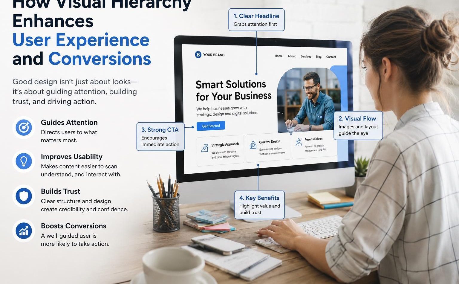
CTA placement is one of the most direct and measurable expressions of visual hierarchy in conversion design. A call to action that is placed, sized, and styled in alignment with the page’s visual hierarchy performs significantly better than one that is treated as an afterthought.
Above the Fold vs Below the Fold
The convention of placing primary calls to action above the fold visible without scrolling remains relevant, but it is not an absolute rule. The right position for a CTA depends on the complexity of the decision being asked of the visitor.
Visual Isolation and Contrast
A CTA that blends visually into its surrounding content is not functioning as a call to action it is functioning as a design element that happens to contain an instruction. Effective CTA placement combines positional logic with visual isolation: the button or element is sized and coloured to stand out from its context, surrounded by sufficient whitespace to separate it from competing elements, and positioned at the natural conclusion of the informational content that precedes it.
Repeating CTAs Strategically
On longer pages service pages, landing pages, detailed guides repeating the primary CTA at multiple points is a well-established conversion design practice. The first instance captures visitors who are ready to act early. Subsequent instances re-engage visitors who have continued reading and are ready to act after absorbing more content.
Applying Visual Hierarchy to Conversion Design
The ultimate purpose of website visual hierarchy in a commercial web design context is to make conversion easier. Every design decision from the scale of the headline to the colour of the button to the amount of whitespace around the primary call to action either serves or undermines that purpose.
Lead With the Value Proposition
The most important piece of information on any commercial page is the answer to the visitor’s first question: what is this, and why does it matter to me? The visual hierarchy of the page should ensure that this value proposition is the first thing the visitor processes through scale, positioning.
A value proposition buried below a navigation bar, a hero image with no text, and a subheading before the main headline is a visual hierarchy that has failed at its most fundamental task.
Create a Clear Visual Path
Every page should have a designed visual path a sequence in which the visitor’s attention is intended to move from one element to the next. That path typically begins with the headline, moves to the supporting subheading or value reinforcement, proceeds through the key benefits or content, and arrives at the call to action.
Designing this path requires making deliberate decisions about what receives visual emphasis at each stage. Elements that are part of the primary path should be more visually prominent than supporting elements.
Consistency as a Trust Signal
Visual hierarchy is not only about directing attention it is also about communicating professionalism and building trust. A page with inconsistent visual treatment varying heading sizes, misaligned elements, random colour usage reads as unpolished and undermines the visitor’s confidence in the brand behind it.
Consistent application of a visual hierarchy system across an entire website using the same typographic scale, the same colour treatment for similar elements, the same spacing conventions throughout creates an experience that feels coherent and reliable.
Conclusion
Visual hierarchy in web design is the bridge between a page that looks reasonable and a page that actually works. It is the system through which a designer communicates what matters, guides the visitor toward understanding, and creates the conditions in which conversion becomes the natural next step.
The principles behind it pre-attentive processing, Gestalt psychology, cognitive load reduction are not new. But their application in a web context requires both theoretical understanding and practical discipline.
Visibility Vault helps businesses build web experiences where design and strategy work together where visual hierarchy, UX psychology, CTA placement, and conversion design combine to turn well-designed pages into genuinely high-performing ones.
FAQ’S
Q1: What is visual hierarchy in web design and why does it matter?
Ans. Visual hierarchy in web design is the deliberate arrangement of visual elements including size, colour, contrast, typography, spacing, and positioning to communicate the relative importance of different elements and guide the user’s attention through a page in a specific sequence.
Q2: How does UX psychology relate to visual hierarchy?
Ans. UX psychology explains the perceptual and cognitive mechanisms that make visual hierarchy effective. Pre-attentive processing explains why high-contrast, large, or brightly coloured elements capture attention before conscious thought.
Q3: What is the most important element to prioritise in a page’s visual hierarchy?
Ans. The value proposition the clear, concise statement of what the page offers and why it matters to the visitor should receive the highest visual priority on any commercial page. It should be the first element the visitor’s eye lands on, communicated through dominant size, strong contrast, and prominent positioning.
Q4: How does CTA placement relate to visual hierarchy?
Ans. CTA placement is one of the most direct expressions of visual hierarchy in conversion design. A call to action positioned at the natural conclusion of the page’s informational journey surrounded by sufficient whitespace.
Q5: Can visual hierarchy improve conversion rates without changing page content?
Ans. Yes, significantly. Many conversion improvements come not from changing what a page says but from changing how it presents what it says.